
1
2
3
4
5
6
7
8
9
10
11
12
13
14
15
16
17
18
19
20
21
22
23
24
25
26
27
28
29
30
31
32
33
34
35
36
37
38
39
40
41
42
43
44
45
46
47
48
49
50
51
52
53
54
55
56
57
58
59
60
61
62
63
64
65
66
67
68
69
70
71
72
73
74
75
76
77
78
79
80
81
82
83
84
85
86
87
88
89
90
91
92
93
94
95
96
97
98
99
100
101
102
103
104
105
106
107
108
109
110
111
112
113
114
115
116
117
118
119
120
121
122
123
124
125
126
127
128
129
130
131
132
133
134
135
136
137
138
139
140
141
142
143
144
145
146
147
148
149
150
151
152
153
154
155
156
157
158
159
160
161
162
163
164
165
166
167
168
169
170
171
172
173
174
175
176
177
178
179
180
181
182
183
184
185
186
187
188
189
190
191
192
193
194
195
196
197
198
199
200
201
202
203
204
205
206
207
208
209
210
211
212
213
214
215
216
217
218
219
220
221
222
223
224
225
226
227
228
229
230
231
232
233
234
235
236
237
238
239
240
241
242
243
244
245
246
247
248
249
250
251
252
253
254
255
256
257
258
259
260
261
262
263
264
265
266
267
268
269
270
271
272
273
274
275
276
277
278
279
280
281
282
283
284
285
286
287
288
289
290
291
292
293
294
295
296
297
298
299
300
301
302
303
304
305
306
307
308
309
310
311
312
313
314
315
316
317
318
319
320
321
322
323
324
325
326
327
328
329
330
331
332
333
334
335
336
337
338
339
340
341
342
343
344
345
346
347
348
349
350
351
352
353
354
355
356
357
358
359
360
361
362
363
364
365
366
367
368
369
370
371
372
373
374
375
376
377
378
379
380
381
382
383
384
385
386
387
388
389
390
391
392
393
394
395
396
397
398
399
400
401
402
403
404
405
406
407
408
409
410
411
412
413
414
415
416
417
418
419
420
421
422
423
424
425
426
427
428
429
430
431
432
433
434
435
436
437
438
439
440
441
442
443
444
445
446
447
448
449
450
451
// Copyright 2014 The Flutter Authors. All rights reserved.
// Use of this source code is governed by a BSD-style license that can be
// found in the LICENSE file.
import 'package:flutter/widgets.dart';
import 'list_tile.dart';
import 'radio.dart';
import 'theme.dart';
import 'theme_data.dart';
// Examples can assume:
// void setState(VoidCallback fn) { }
/// A [ListTile] with a [Radio]. In other words, a radio button with a label.
///
/// The entire list tile is interactive: tapping anywhere in the tile selects
/// the radio button.
///
/// The [value], [groupValue], [onChanged], and [activeColor] properties of this
/// widget are identical to the similarly-named properties on the [Radio]
/// widget. The type parameter `T` serves the same purpose as that of the
/// [Radio] class' type parameter.
///
/// The [title], [subtitle], [isThreeLine], and [dense] properties are like
/// those of the same name on [ListTile].
///
/// The [selected] property on this widget is similar to the [ListTile.selected]
/// property, but the color used is that described by [activeColor], if any,
/// defaulting to the accent color of the current [Theme]. No effort is made to
/// coordinate the [selected] state and the [checked] state; to have the list
/// tile appear selected when the radio button is the selected radio button, set
/// [selected] to true when [value] matches [groupValue].
///
/// The radio button is shown on the left by default in left-to-right languages
/// (i.e. the leading edge). This can be changed using [controlAffinity]. The
/// [secondary] widget is placed on the opposite side. This maps to the
/// [ListTile.leading] and [ListTile.trailing] properties of [ListTile].
///
/// To show the [RadioListTile] as disabled, pass null as the [onChanged]
/// callback.
///
/// {@tool snippet --template=stateful_widget_scaffold}
///
/// 
///
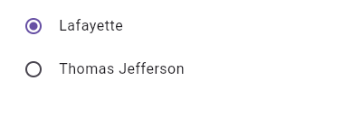
/// This widget shows a pair of radio buttons that control the `_character`
/// field. The field is of the type `SingingCharacter`, an enum.
///
/// ```dart preamble
/// enum SingingCharacter { lafayette, jefferson }
/// ```
/// ```dart
/// SingingCharacter _character = SingingCharacter.lafayette;
///
/// @override
/// Widget build(BuildContext context) {
/// return Column(
/// children: <Widget>[
/// RadioListTile<SingingCharacter>(
/// title: const Text('Lafayette'),
/// value: SingingCharacter.lafayette,
/// groupValue: _character,
/// onChanged: (SingingCharacter value) { setState(() { _character = value; }); },
/// ),
/// RadioListTile<SingingCharacter>(
/// title: const Text('Thomas Jefferson'),
/// value: SingingCharacter.jefferson,
/// groupValue: _character,
/// onChanged: (SingingCharacter value) { setState(() { _character = value; }); },
/// ),
/// ],
/// );
/// }
/// ```
/// {@end-tool}
///
/// ## Semantics in RadioListTile
///
/// Since the entirety of the RadioListTile is interactive, it should represent
/// itself as a single interactive entity.
///
/// To do so, a RadioListTile widget wraps its children with a [MergeSemantics]
/// widget. [MergeSemantics] will attempt to merge its descendant [Semantics]
/// nodes into one node in the semantics tree. Therefore, RadioListTile will
/// throw an error if any of its children requires its own [Semantics] node.
///
/// For example, you cannot nest a [RichText] widget as a descendant of
/// RadioListTile. [RichText] has an embedded gesture recognizer that
/// requires its own [Semantics] node, which directly conflicts with
/// RadioListTile's desire to merge all its descendants' semantic nodes
/// into one. Therefore, it may be necessary to create a custom radio tile
/// widget to accommodate similar use cases.
///
/// {@tool snippet --template=stateful_widget_scaffold}
///
/// 
///
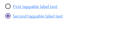
/// Here is an example of a custom labeled radio widget, called
/// LinkedLabelRadio, that includes an interactive [RichText] widget that
/// handles tap gestures.
///
/// ```dart imports
/// import 'package:flutter/gestures.dart';
/// ```
/// ```dart preamble
/// class LinkedLabelRadio extends StatelessWidget {
/// const LinkedLabelRadio({
/// this.label,
/// this.padding,
/// this.groupValue,
/// this.value,
/// this.onChanged,
/// });
///
/// final String label;
/// final EdgeInsets padding;
/// final bool groupValue;
/// final bool value;
/// final Function onChanged;
///
/// @override
/// Widget build(BuildContext context) {
/// return Padding(
/// padding: padding,
/// child: Row(
/// children: <Widget>[
/// Radio<bool>(
/// groupValue: groupValue,
/// value: value,
/// onChanged: (bool newValue) {
/// onChanged(newValue);
/// }
/// ),
/// RichText(
/// text: TextSpan(
/// text: label,
/// style: TextStyle(
/// color: Colors.blueAccent,
/// decoration: TextDecoration.underline,
/// ),
/// recognizer: TapGestureRecognizer()
/// ..onTap = () {
/// print('Label has been tapped.');
/// },
/// ),
/// ),
/// ],
/// ),
/// );
/// }
/// }
/// ```
/// ```dart
/// bool _isRadioSelected = false;
///
/// @override
/// Widget build(BuildContext context) {
/// return Scaffold(
/// body: Column(
/// mainAxisAlignment: MainAxisAlignment.center,
/// children: <Widget>[
/// LinkedLabelRadio(
/// label: 'First tappable label text',
/// padding: EdgeInsets.symmetric(horizontal: 5.0),
/// value: true,
/// groupValue: _isRadioSelected,
/// onChanged: (bool newValue) {
/// setState(() {
/// _isRadioSelected = newValue;
/// });
/// },
/// ),
/// LinkedLabelRadio(
/// label: 'Second tappable label text',
/// padding: EdgeInsets.symmetric(horizontal: 5.0),
/// value: false,
/// groupValue: _isRadioSelected,
/// onChanged: (bool newValue) {
/// setState(() {
/// _isRadioSelected = newValue;
/// });
/// },
/// ),
/// ],
/// ),
/// );
/// }
/// ```
/// {@end-tool}
///
/// ## RadioListTile isn't exactly what I want
///
/// If the way RadioListTile pads and positions its elements isn't quite what
/// you're looking for, you can create custom labeled radio widgets by
/// combining [Radio] with other widgets, such as [Text], [Padding] and
/// [InkWell].
///
/// {@tool snippet --template=stateful_widget_scaffold}
///
/// 
///
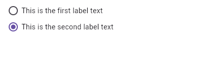
/// Here is an example of a custom LabeledRadio widget, but you can easily
/// make your own configurable widget.
///
/// ```dart preamble
/// class LabeledRadio extends StatelessWidget {
/// const LabeledRadio({
/// this.label,
/// this.padding,
/// this.groupValue,
/// this.value,
/// this.onChanged,
/// });
///
/// final String label;
/// final EdgeInsets padding;
/// final bool groupValue;
/// final bool value;
/// final Function onChanged;
///
/// @override
/// Widget build(BuildContext context) {
/// return InkWell(
/// onTap: () {
/// if (value != groupValue)
/// onChanged(value);
/// },
/// child: Padding(
/// padding: padding,
/// child: Row(
/// children: <Widget>[
/// Radio<bool>(
/// groupValue: groupValue,
/// value: value,
/// onChanged: (bool newValue) {
/// onChanged(newValue);
/// },
/// ),
/// Text(label),
/// ],
/// ),
/// ),
/// );
/// }
/// }
/// ```
/// ```dart
/// bool _isRadioSelected = false;
///
/// @override
/// Widget build(BuildContext context) {
/// return Scaffold(
/// body: Column(
/// mainAxisAlignment: MainAxisAlignment.center,
/// children: <LabeledRadio>[
/// LabeledRadio(
/// label: 'This is the first label text',
/// padding: const EdgeInsets.symmetric(horizontal: 5.0),
/// value: true,
/// groupValue: _isRadioSelected,
/// onChanged: (bool newValue) {
/// setState(() {
/// _isRadioSelected = newValue;
/// });
/// },
/// ),
/// LabeledRadio(
/// label: 'This is the second label text',
/// padding: const EdgeInsets.symmetric(horizontal: 5.0),
/// value: false,
/// groupValue: _isRadioSelected,
/// onChanged: (bool newValue) {
/// setState(() {
/// _isRadioSelected = newValue;
/// });
/// },
/// ),
/// ],
/// ),
/// );
/// }
/// ```
/// {@end-tool}
///
/// See also:
///
/// * [ListTileTheme], which can be used to affect the style of list tiles,
/// including radio list tiles.
/// * [CheckboxListTile], a similar widget for checkboxes.
/// * [SwitchListTile], a similar widget for switches.
/// * [ListTile] and [Radio], the widgets from which this widget is made.
class RadioListTile<T> extends StatelessWidget {
/// Creates a combination of a list tile and a radio button.
///
/// The radio tile itself does not maintain any state. Instead, when the radio
/// button is selected, the widget calls the [onChanged] callback. Most
/// widgets that use a radio button will listen for the [onChanged] callback
/// and rebuild the radio tile with a new [groupValue] to update the visual
/// appearance of the radio button.
///
/// The following arguments are required:
///
/// * [value] and [groupValue] together determine whether the radio button is
/// selected.
/// * [onChanged] is called when the user selects this radio button.
const RadioListTile({
Key key,
@required this.value,
@required this.groupValue,
@required this.onChanged,
this.activeColor,
this.title,
this.subtitle,
this.isThreeLine = false,
this.dense,
this.secondary,
this.selected = false,
this.controlAffinity = ListTileControlAffinity.platform,
}) : assert(isThreeLine != null),
assert(!isThreeLine || subtitle != null),
assert(selected != null),
assert(controlAffinity != null),
super(key: key);
/// The value represented by this radio button.
final T value;
/// The currently selected value for this group of radio buttons.
///
/// This radio button is considered selected if its [value] matches the
/// [groupValue].
final T groupValue;
/// Called when the user selects this radio button.
///
/// The radio button passes [value] as a parameter to this callback. The radio
/// button does not actually change state until the parent widget rebuilds the
/// radio tile with the new [groupValue].
///
/// If null, the radio button will be displayed as disabled.
///
/// The provided callback will not be invoked if this radio button is already
/// selected.
///
/// The callback provided to [onChanged] should update the state of the parent
/// [StatefulWidget] using the [State.setState] method, so that the parent
/// gets rebuilt; for example:
///
/// ```dart
/// RadioListTile<SingingCharacter>(
/// title: const Text('Lafayette'),
/// value: SingingCharacter.lafayette,
/// groupValue: _character,
/// onChanged: (SingingCharacter newValue) {
/// setState(() {
/// _character = newValue;
/// });
/// },
/// )
/// ```
final ValueChanged<T> onChanged;
/// The color to use when this radio button is selected.
///
/// Defaults to accent color of the current [Theme].
final Color activeColor;
/// The primary content of the list tile.
///
/// Typically a [Text] widget.
final Widget title;
/// Additional content displayed below the title.
///
/// Typically a [Text] widget.
final Widget subtitle;
/// A widget to display on the opposite side of the tile from the radio button.
///
/// Typically an [Icon] widget.
final Widget secondary;
/// Whether this list tile is intended to display three lines of text.
///
/// If false, the list tile is treated as having one line if the subtitle is
/// null and treated as having two lines if the subtitle is non-null.
final bool isThreeLine;
/// Whether this list tile is part of a vertically dense list.
///
/// If this property is null then its value is based on [ListTileTheme.dense].
final bool dense;
/// Whether to render icons and text in the [activeColor].
///
/// No effort is made to automatically coordinate the [selected] state and the
/// [checked] state. To have the list tile appear selected when the radio
/// button is the selected radio button, set [selected] to true when [value]
/// matches [groupValue].
///
/// Normally, this property is left to its default value, false.
final bool selected;
/// Where to place the control relative to the text.
final ListTileControlAffinity controlAffinity;
/// Whether this radio button is checked.
///
/// To control this value, set [value] and [groupValue] appropriately.
bool get checked => value == groupValue;
@override
Widget build(BuildContext context) {
final Widget control = Radio<T>(
value: value,
groupValue: groupValue,
onChanged: onChanged,
activeColor: activeColor,
materialTapTargetSize: MaterialTapTargetSize.shrinkWrap,
);
Widget leading, trailing;
switch (controlAffinity) {
case ListTileControlAffinity.leading:
case ListTileControlAffinity.platform:
leading = control;
trailing = secondary;
break;
case ListTileControlAffinity.trailing:
leading = secondary;
trailing = control;
break;
}
return MergeSemantics(
child: ListTileTheme.merge(
selectedColor: activeColor ?? Theme.of(context).accentColor,
child: ListTile(
leading: leading,
title: title,
subtitle: subtitle,
trailing: trailing,
isThreeLine: isThreeLine,
dense: dense,
enabled: onChanged != null,
onTap: onChanged != null && !checked ? () { onChanged(value); } : null,
selected: selected,
),
),
);
}
}