// Copyright 2014 The Flutter Authors. All rights reserved.
// Use of this source code is governed by a BSD-style license that can be
// found in the LICENSE file.
// @dart = 2.8
import 'package:flutter/services.dart';
import 'package:flutter/widgets.dart';
import 'input_decorator.dart';
import 'text_field.dart';
import 'theme.dart';
export 'package:flutter/services.dart' show SmartQuotesType, SmartDashesType;
/// A [FormField] that contains a [TextField].
///
/// This is a convenience widget that wraps a [TextField] widget in a
/// [FormField].
///
/// A [Form] ancestor is not required. The [Form] simply makes it easier to
/// save, reset, or validate multiple fields at once. To use without a [Form],
/// pass a [GlobalKey] to the constructor and use [GlobalKey.currentState] to
/// save or reset the form field.
///
/// When a [controller] is specified, its [TextEditingController.text]
/// defines the [initialValue]. If this [FormField] is part of a scrolling
/// container that lazily constructs its children, like a [ListView] or a
/// [CustomScrollView], then a [controller] should be specified.
/// The controller's lifetime should be managed by a stateful widget ancestor
/// of the scrolling container.
///
/// If a [controller] is not specified, [initialValue] can be used to give
/// the automatically generated controller an initial value.
///
/// Remember to call [TextEditingController.dispose] of the [TextEditingController]
/// when it is no longer needed. This will ensure we discard any resources used
/// by the object.
///
/// By default, `decoration` will apply the [ThemeData.inputDecorationTheme] for
/// the current context to the [InputDecoration], see
/// [InputDecoration.applyDefaults].
///
/// For a documentation about the various parameters, see [TextField].
///
/// {@tool snippet}
///
/// Creates a [TextFormField] with an [InputDecoration] and validator function.
///
/// 
///
/// 
///
/// ```dart
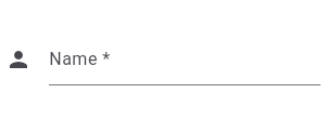
/// TextFormField(
/// decoration: const InputDecoration(
/// icon: Icon(Icons.person),
/// hintText: 'What do people call you?',
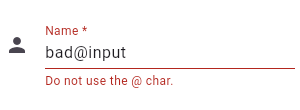
/// labelText: 'Name *',
/// ),
/// onSaved: (String value) {
/// // This optional block of code can be used to run
/// // code when the user saves the form.
/// },
/// validator: (String value) {
/// return value.contains('@') ? 'Do not use the @ char.' : null;
/// },
/// )
/// ```
/// {@end-tool}
///
/// {@tool dartpad --template=stateful_widget_material}
/// This example shows how to move the focus to the next field when the user
/// presses the ENTER key.
///
/// ```dart imports
/// import 'package:flutter/services.dart';
/// ```
///
/// ```dart
/// Widget build(BuildContext context) {
/// return Material(
/// child: Center(
/// child: Shortcuts(
/// shortcuts: <LogicalKeySet, Intent>{
/// // Pressing space in the field will now move to the next field.
/// LogicalKeySet(LogicalKeyboardKey.space): const NextFocusIntent(),
/// },
/// child: FocusTraversalGroup(
/// child: Form(
/// autovalidate: true,
/// onChanged: () {
/// Form.of(primaryFocus.context).save();
/// },
/// child: Wrap(
/// children: List<Widget>.generate(5, (int index) {
/// return Padding(
/// padding: const EdgeInsets.all(8.0),
/// child: ConstrainedBox(
/// constraints: BoxConstraints.tight(const Size(200, 50)),
/// child: TextFormField(
/// onSaved: (String value) {
/// print('Value for field $index saved as "$value"');
/// },
/// ),
/// ),
/// );
/// }),
/// ),
/// ),
/// ),
/// ),
/// ),
/// );
/// }
/// ```
/// {@end-tool}
///
/// See also:
///
/// * <https://material.io/design/components/text-fields.html>
/// * [TextField], which is the underlying text field without the [Form]
/// integration.
/// * [InputDecorator], which shows the labels and other visual elements that
/// surround the actual text editing widget.
/// * Learn how to use a [TextEditingController] in one of our [cookbook recipes](https://flutter.dev/docs/cookbook/forms/text-field-changes#2-use-a-texteditingcontroller).
class TextFormField extends FormField<String> {
/// Creates a [FormField] that contains a [TextField].
///
/// When a [controller] is specified, [initialValue] must be null (the
/// default). If [controller] is null, then a [TextEditingController]
/// will be constructed automatically and its `text` will be initialized
/// to [initialValue] or the empty string.
///
/// For documentation about the various parameters, see the [TextField] class
/// and [new TextField], the constructor.
TextFormField({
Key key,
this.controller,
String initialValue,
FocusNode focusNode,
InputDecoration decoration = const InputDecoration(),
TextInputType keyboardType,
TextCapitalization textCapitalization = TextCapitalization.none,
TextInputAction textInputAction,
TextStyle style,
StrutStyle strutStyle,
TextDirection textDirection,
TextAlign textAlign = TextAlign.start,
TextAlignVertical textAlignVertical,
bool autofocus = false,
bool readOnly = false,
ToolbarOptions toolbarOptions,
bool showCursor,
String obscuringCharacter = '•',
bool obscureText = false,
bool autocorrect = true,
SmartDashesType smartDashesType,
SmartQuotesType smartQuotesType,
bool enableSuggestions = true,
bool autovalidate = false,
bool maxLengthEnforced = true,
int maxLines = 1,
int minLines,
bool expands = false,
int maxLength,
ValueChanged<String> onChanged,
GestureTapCallback onTap,
VoidCallback onEditingComplete,
ValueChanged<String> onFieldSubmitted,
FormFieldSetter<String> onSaved,
FormFieldValidator<String> validator,
List<TextInputFormatter> inputFormatters,
bool enabled,
double cursorWidth = 2.0,
double cursorHeight,
Radius cursorRadius,
Color cursorColor,
Brightness keyboardAppearance,
EdgeInsets scrollPadding = const EdgeInsets.all(20.0),
bool enableInteractiveSelection = true,
InputCounterWidgetBuilder buildCounter,
ScrollPhysics scrollPhysics,
Iterable<String> autofillHints,
AutovalidateMode autovalidateMode,
}) : assert(initialValue == null || controller == null),
assert(textAlign != null),
assert(autofocus != null),
assert(readOnly != null),
assert(obscuringCharacter != null && obscuringCharacter.length == 1),
assert(obscureText != null),
assert(autocorrect != null),
assert(enableSuggestions != null),
assert(autovalidate != null),
assert(
autovalidate == false ||
autovalidate == true && autovalidateMode == null,
'autovalidate and autovalidateMode should not be used together.'
),
assert(maxLengthEnforced != null),
assert(scrollPadding != null),
assert(maxLines == null || maxLines > 0),
assert(minLines == null || minLines > 0),
assert(
(maxLines == null) || (minLines == null) || (maxLines >= minLines),
"minLines can't be greater than maxLines",
),
assert(expands != null),
assert(
!expands || (maxLines == null && minLines == null),
'minLines and maxLines must be null when expands is true.',
),
assert(!obscureText || maxLines == 1, 'Obscured fields cannot be multiline.'),
assert(maxLength == null || maxLength > 0),
assert(enableInteractiveSelection != null),
super(
key: key,
initialValue: controller != null ? controller.text : (initialValue ?? ''),
onSaved: onSaved,
validator: validator,
enabled: enabled ?? decoration?.enabled ?? true,
autovalidateMode: autovalidate
? AutovalidateMode.always
: (autovalidateMode ?? AutovalidateMode.disabled),
builder: (FormFieldState<String> field) {
final _TextFormFieldState state = field as _TextFormFieldState;
final InputDecoration effectiveDecoration = (decoration ?? const InputDecoration())
.applyDefaults(Theme.of(field.context).inputDecorationTheme);
void onChangedHandler(String value) {
if (onChanged != null) {
onChanged(value);
}
field.didChange(value);
}
return TextField(
controller: state._effectiveController,
focusNode: focusNode,
decoration: effectiveDecoration.copyWith(errorText: field.errorText),
keyboardType: keyboardType,
textInputAction: textInputAction,
style: style,
strutStyle: strutStyle,
textAlign: textAlign,
textAlignVertical: textAlignVertical,
textDirection: textDirection,
textCapitalization: textCapitalization,
autofocus: autofocus,
toolbarOptions: toolbarOptions,
readOnly: readOnly,
showCursor: showCursor,
obscuringCharacter: obscuringCharacter,
obscureText: obscureText,
autocorrect: autocorrect,
smartDashesType: smartDashesType ?? (obscureText ? SmartDashesType.disabled : SmartDashesType.enabled),
smartQuotesType: smartQuotesType ?? (obscureText ? SmartQuotesType.disabled : SmartQuotesType.enabled),
enableSuggestions: enableSuggestions,
maxLengthEnforced: maxLengthEnforced,
maxLines: maxLines,
minLines: minLines,
expands: expands,
maxLength: maxLength,
onChanged: onChangedHandler,
onTap: onTap,
onEditingComplete: onEditingComplete,
onSubmitted: onFieldSubmitted,
inputFormatters: inputFormatters,
enabled: enabled ?? decoration?.enabled ?? true,
cursorWidth: cursorWidth,
cursorHeight: cursorHeight,
cursorRadius: cursorRadius,
cursorColor: cursorColor,
scrollPadding: scrollPadding,
scrollPhysics: scrollPhysics,
keyboardAppearance: keyboardAppearance,
enableInteractiveSelection: enableInteractiveSelection,
buildCounter: buildCounter,
autofillHints: autofillHints,
);
},
);
/// Controls the text being edited.
///
/// If null, this widget will create its own [TextEditingController] and
/// initialize its [TextEditingController.text] with [initialValue].
final TextEditingController controller;
@override
_TextFormFieldState createState() => _TextFormFieldState();
}
class _TextFormFieldState extends FormFieldState<String> {
TextEditingController _controller;
TextEditingController get _effectiveController => widget.controller ?? _controller;
@override
TextFormField get widget => super.widget as TextFormField;
@override
void initState() {
super.initState();
if (widget.controller == null) {
_controller = TextEditingController(text: widget.initialValue);
} else {
widget.controller.addListener(_handleControllerChanged);
}
}
@override
void didUpdateWidget(TextFormField oldWidget) {
super.didUpdateWidget(oldWidget);
if (widget.controller != oldWidget.controller) {
oldWidget.controller?.removeListener(_handleControllerChanged);
widget.controller?.addListener(_handleControllerChanged);
if (oldWidget.controller != null && widget.controller == null)
_controller = TextEditingController.fromValue(oldWidget.controller.value);
if (widget.controller != null) {
setValue(widget.controller.text);
if (oldWidget.controller == null)
_controller = null;
}
}
}
@override
void dispose() {
widget.controller?.removeListener(_handleControllerChanged);
super.dispose();
}
@override
void didChange(String value) {
super.didChange(value);
if (_effectiveController.text != value)
_effectiveController.text = value;
}
@override
void reset() {
super.reset();
setState(() {
_effectiveController.text = widget.initialValue;
});
}
void _handleControllerChanged() {
// Suppress changes that originated from within this class.
//
// In the case where a controller has been passed in to this widget, we
// register this change listener. In these cases, we'll also receive change
// notifications for changes originating from within this class -- for
// example, the reset() method. In such cases, the FormField value will
// already have been set.
if (_effectiveController.text != value)
didChange(_effectiveController.text);
}
}